Sunday, September 29, 2024

APPLICATION DESIGN (Project 4:Completed Mobile Application Design Prototype )

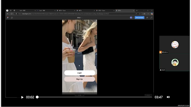
Application Design /Final Project: High Fidelity App Design Prototype

Week 13- Week 15:

1. Colour Palette 
2. Design Progress
3. Usability Testing
Final Outcome

In this phase of learning, I first studied the Colour Palette in depth, understood the color theory and the impact of different color combinations on users' emotions and visual experience, and learned how to choose a color scheme that matches the style of the project and the target audience, so as to set the visual tone for the design.

 In terms of Design Progress, from the initial conceptualization to the concrete design implementation, I mastered the design process and methodology at different stages, including the use of Wireframe and UI kit, which improved the logic and consistency of the design, and transformed the ideas into actual design works.

 Usability Testing allows me to evaluate the ease of use and effectiveness of the design from the user's point of view, and to collect feedback data to find out the problems in the design and make targeted improvements, which enhances the practicality of the product and user satisfaction.

 In the end, through the integration of the above learning outcomes, I reached the Final Outcome, which not only made significant progress in design skills, but also cultivated user-centered design thinking, and was able to create design works with aesthetics, functionality, and ease of use, which accumulates valuable experience for future learning and practice

User testing summary:

 (User 1) ChunXiao

 She suggested that I add a background color after the text on the page where you click to start shopping to make the text more visible.

 (User 2) JiaQi

 After using it, she said that it's not possible to change the number of items and it's troublesome if you buy a lot of clothes, so it would be better to add a function to change the number of items.

 (User 3) Huier

 She usually wants to check the progress after returning a product, so she needs to add a feature to check the progress after returning a product.


Color matching/Icon/Button/typeface


ENVIRONMENT DESIGN 1

WEEK 1

In this class, after explaining one-point perspective and two-point perspective, the teacher drew some practice drawings such as geometries and building outlines to deepen our understanding of perspective.


WEEK 2

In today's practical session, the art supplies we purchased last week finally got their chance to shine. As per the teacher's instructions, our first task was to create two sizable boxes on an A3 sheet, ensuring a two-centimeter gap between them. Subsequently, we had to draw 12 evenly spaced grids, also with a two-centimeter interval. I must admit, my hand wasn't as steady as I'd hoped, resulting in some wonky lines that needed to be redrawn. But I'm hopeful that with more practice in the future, my skills will improve. For this particular class, we were only required to draw within the two boxes on the first page. The teacher provided a detailed demonstration, which really helped clarify the task and the steps involved. Honestly, I'm a complete novice when it comes to drawing, but thankfully, after seeing the teacher's example, it didn't seem overly daunting. It was just a bit slow-going for me. One important thing to note is that we had to show our initial sketches to the teacher before inking them in. This was to ensure that any mistakes could be corrected beforehand, as an unapproved drawing would mean starting all over again. And that's how my first drawing lesson wrapped up.

WEEK3-4

This month our assignment was to draw the elevation of a magnificent ancient Chinese palace. Initially, I was completely at a loss as to how to begin. I misinterpreted the details and made numerous errors in my initial attempts. The teacher, noticing my struggle, patiently came to my side and demonstrated the correct techniques and proportions once more. With newfound clarity, I grasped the essence of the drawing and was ultimately able to complete the elevation with confidence.

This month's follow-up task is to transform the elevation drawings of the palace we created last week into perspective renderings. This requires us to skillfully apply the principles of both one-point and two-point perspective that we have been learning. We are expected to render half of the drawings using one-point perspective to capture the frontal grandeur and symmetry, while converting the other half into two-point perspective to add depth and a more dynamic visual impact. This process demands not only a solid understanding of the perspective theories but also precise measurements and a delicate touch to ensure the palace appears both majestic and realistic in its three-dimensional form. We will need to pay close attention to the vanishing points, the convergence of lines, and the play of light and shadow to bring these architectural visions to life on the paper.


FINAL WEEK

In this lesson, the teacher asked us to search for architectural materials on our own, combine them to design a large building and draw its interior and exterior environments. We all acted quickly. I sifted through the Internet and blended my favorite materials, such as a skyscraper with hard lines and a European-style auditorium with an elegant dome. The interior was designed as an open and bright space, and the exterior was laid out with minimalist landscaping and recreational areas, which were then carefully drawn.


Sptail Design II (project2)

Sptail Design II Task 02:  User Research, Storytelling & Functional Art  Development (I) When User Journey Meets Regenerative Art: A Hea...